top of page
MENU

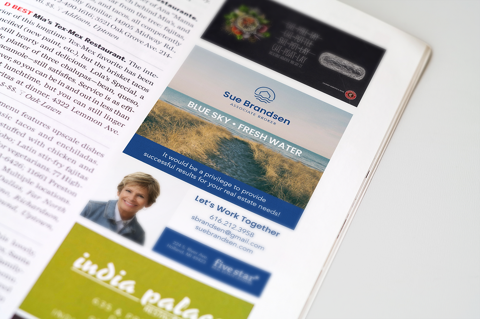
Sue Brandsen
CLIENT
Sue Brandsen
CATEGORY
Logo
WHAT WE DID
We created a fresh and unique mark with a simplified, modern house shape. Then we added waves for the lakeshore and blue for the lake life. The waves were incorporated into a pattern that can be used to add interest to the brands visuals.
BRIEF
Sue wanted a logo that incorporated her current market along the lakeshore in Muskegon. The mark needed to say lakeside homes without alienating the inland market.


bottom of page