top of page
Land 2 Lake
CLIENT
Land 2 Lake
CATEGORY
Visual Identity Package
WHAT WE DID
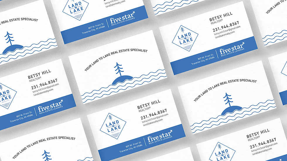
Our approach to this project was to capture the beauty and warmth of Northern Michigan. We drew inspiration from the deep blue hues of Lake Michigan, blending them with emerald and fern green to represent the vast landscape. The main logo contrasts these colors with its clean lines and diamond shape, resembling a sign you might see on a gate as you approach a farm.
BRIEF
Betsy and Chad approached us to create a brand that reflected their roots and their work in Northern Michigan. They primarily focus on waterfront homes and properties where land is a key feature, which inspired the name "Land 2 Lake."


bottom of page
